Time-Based Data: Analyze with Sparkline
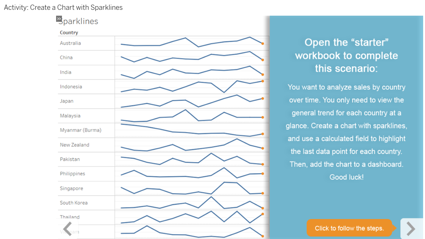
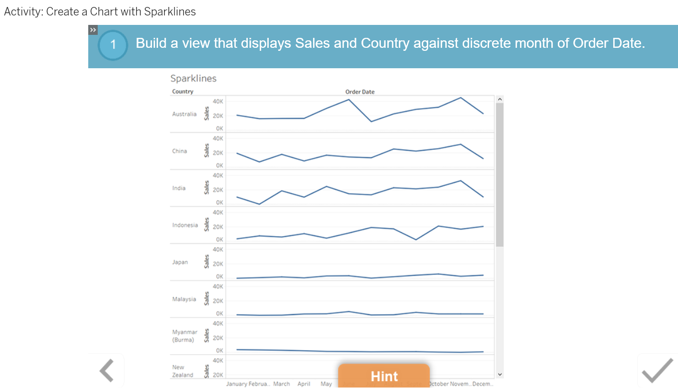
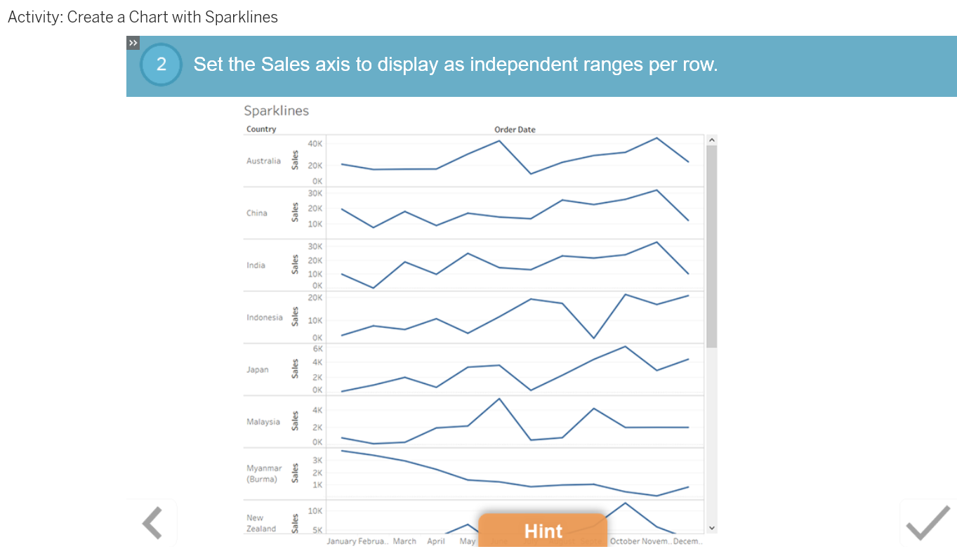
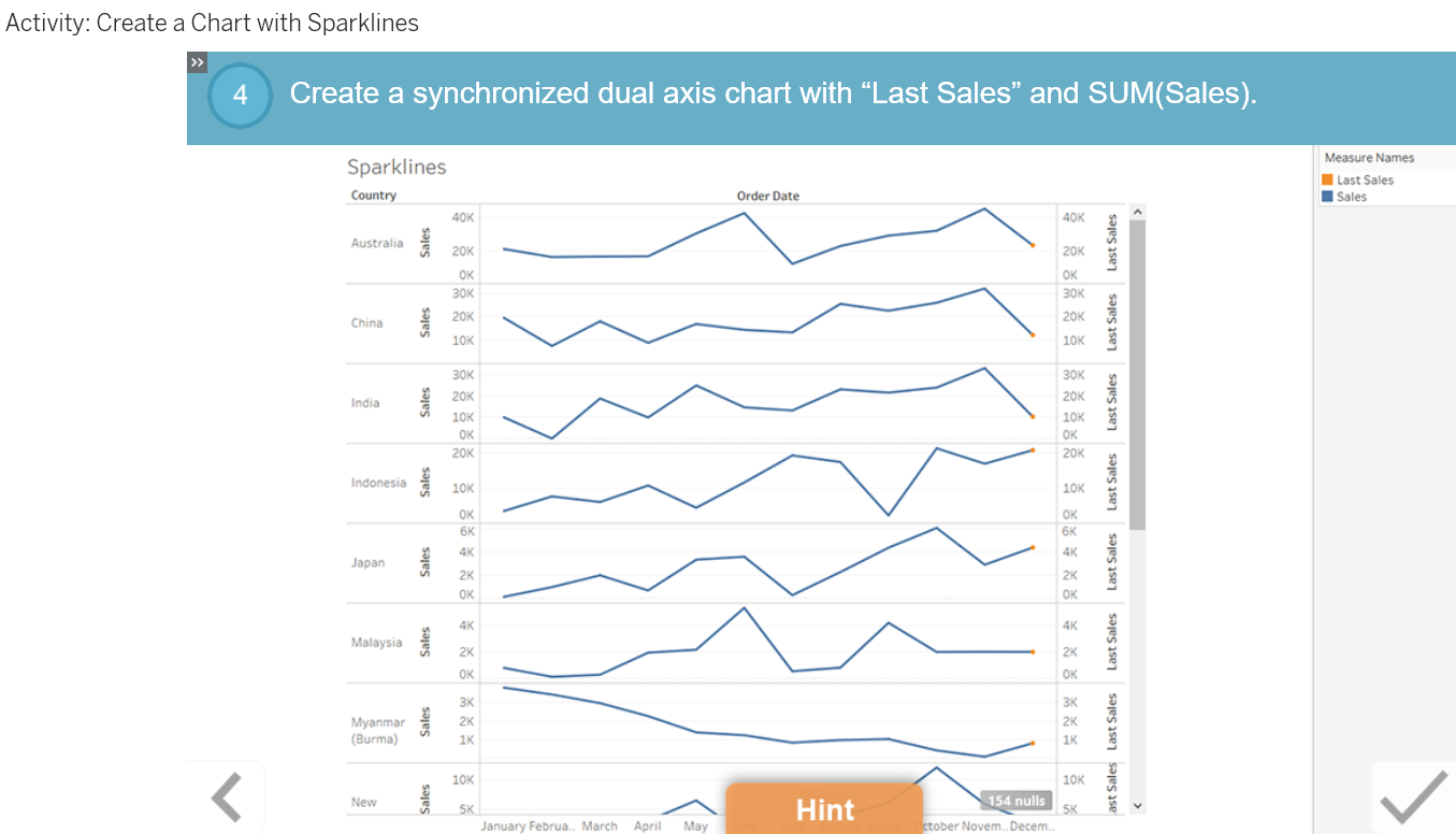
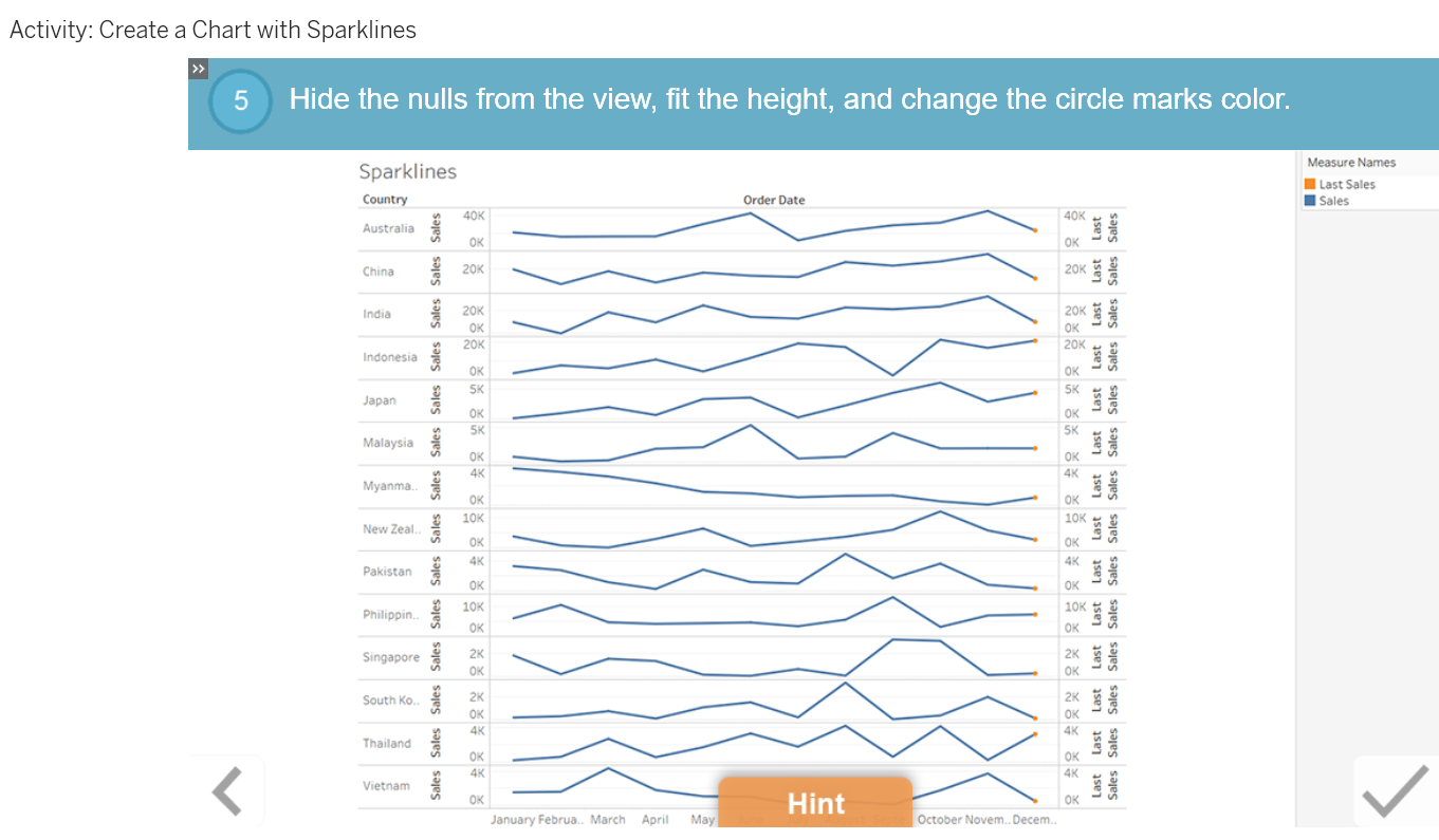
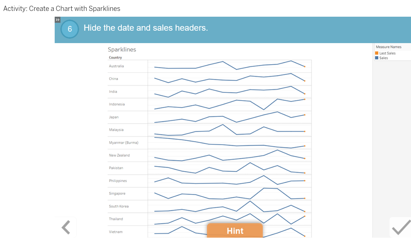
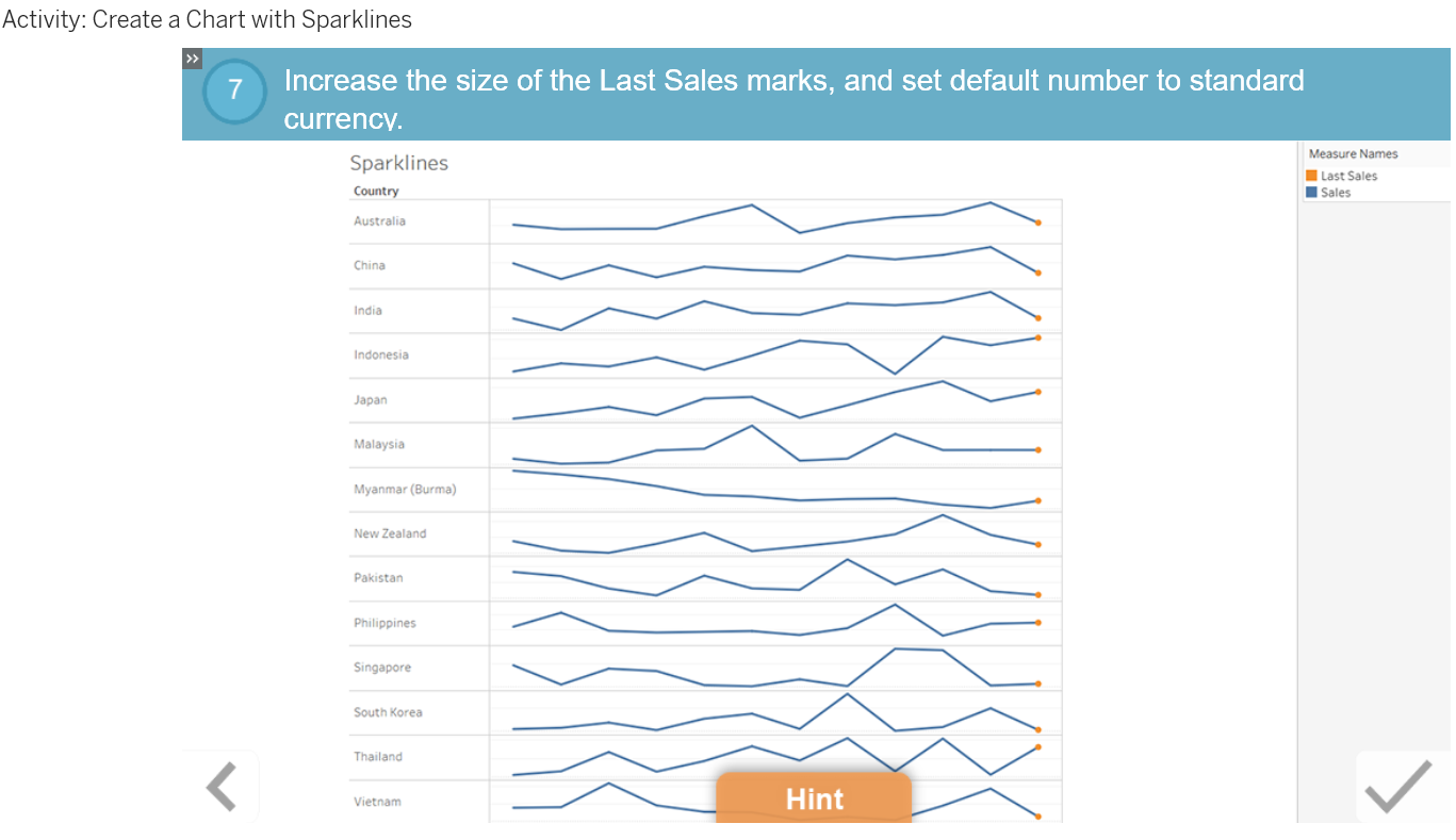
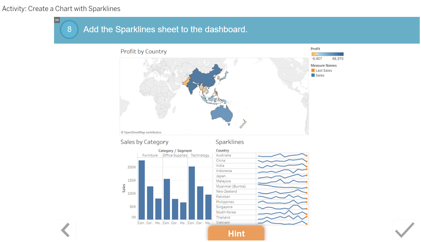
When you want to show a comparison of time-based data, try using a sparkline chart. Sparklines are condensed line graphs that reveal trends and variations over time. In a sparkline chart, you use an independent axis for each row and remove headers and borders. In a dashboard, the chart communicates high-level trends in a simple, compact way.
Lesson Objectives
At the end of this lesson, you will be able to:
- Create a sparkline chart.
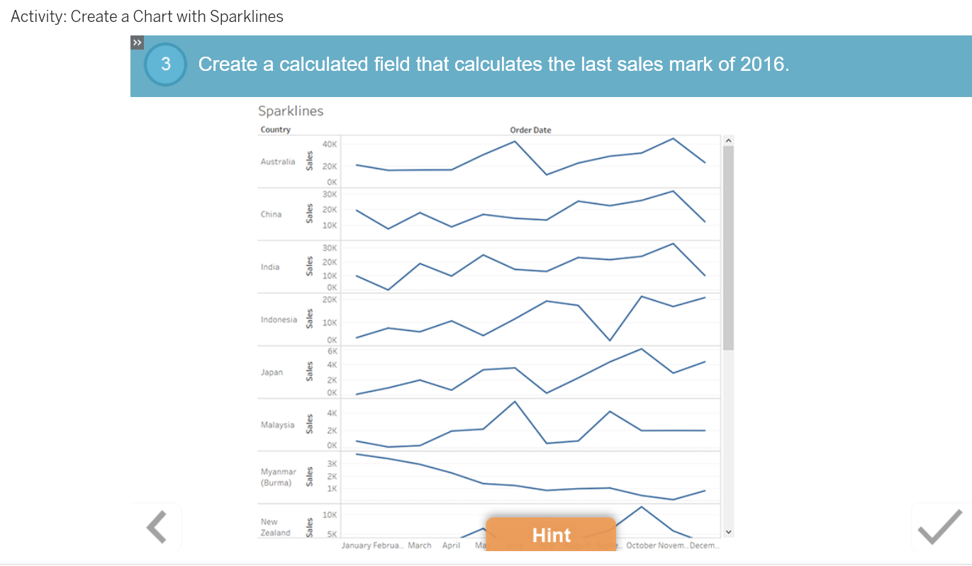
- Use a calculation to create a second mark in the chart.
- Format the chart and use a custom shape.
- Recognize the common uses for sparklines.
- Use sparklines to show time-based data in a view.
- Create a calculation that shows the last sales figure using a distinct mark.
