This website is not an advertising platform for a market-leading Company in data visualization. It simply wants to give some basic information on Tableau Data Analytics Strategy in a very compact format. Most contents was only a copy&paste task and I have no intention to pretend it's developed and written by myself. Nor do I have the intention to earn money with it. I'm just a big fan and addicted to Tableau. Feel free to get some inspiration in my "Hall of Fame". It's more than simply software, it's an approach to address future needs in a global economy.
- The amount of data is growing rapidly
- A networked world is becoming more complex every day
- The decision-making time is getting shorter
This means that companies must have the right "tools" for business information, separate relevant and irrelevant data, and use data in a fast and professional way. Imagine how much time can be saved if we don't have to process reports or ad hoc analysis that seem to come from right out of hell:
- irrelevant and relevant Information mixed
- inconsistent color choice
- colors without meaning
- Data Cemeteries in the form of cross tables
- Charts that do not match the data
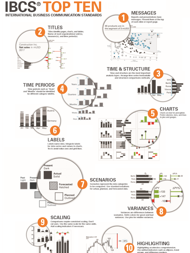
Cut. I admire the work of Prof. Rolf Hichert and would like to promote his SUCCESS RULES and the "International Business Communication Standards". My colleagues often try to wind me up with "always 50 shades of gray" for my visualizations. But I have a good reason for this (the best contrast to red / green). What do you get when you use IBCS with the Tableau Blueprint? A data-driven company that's ready for digital evolution. You can find other interesting suggestions for data visualizations on the IBCS website.
- S AY Convey a message
- U NIFY Apply semantic notation
- C ONDENSE Increase information density
- C HECK Ensure visual integrity
- E XPRESS Choose proper visualization
- S IMPLIFY Avoid clutter
- S TRUCTURE Organize content
