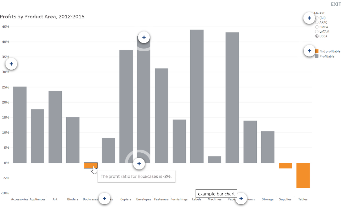
Know the Elements of Charts
You have learned about the advantages of viewing data in a visualization instead of spreadsheet or table, and you are ready to understand more about reading charts. A well-designed chart should be easy to read and understand, and should not mislead. Here's how to be an educated data consumer.
There are three key components of this lesson:
- Know what elements make up a chart in Tableau. This will help you read the views others create.
- Ask questions about what you see. Visualizations can be the start of the exploration of your data and will lead to questions - which is a good thing.
- Watch for misleading charts.
This lesson has a few examples, but there are many ways charts can confuse or mislead. Scrutinize, ask questions, and give feedback to your authors if you are not sure what a chart is attempting to convey.

What does this chart represent?
- Does the chart or dashboard have a clear title and purpose?
- Can you understand the chart's intent in a few moments?
Does this chart show any particular patterns or trends?
- Can you see trends in seasonality (example: every November sales rise)?
- Does your data have any outliers-data points that stand out as very different from the rest of the data-that should be reviewed or explored more closely?
Is this all of the data?
- Does it look like the author deliberately excluded or hid relevant data?
- Can you answer all of your questions with what you see, or do you need more data?
Is it clear what has been measured, and what the numbers represent?
- Has the author included helpful notes, labels, and navigational hints?
- Can you gather useful and actionable data from this chart?
